top of page
01- A
FILM SERIES +
EVENT GRAPHICS
In partnership with Katra Film Series, brand identity for a new film series was developed.
01- A
FILM SERIES +
EVENT GRAPHICS
In partnership with Katra Film Series, brand identity for a new film series was developed.
01- A
FILM SERIES +
EVENT GRAPHICS
In partnership with Katra Film Series, brand identity for a new film series was developed.

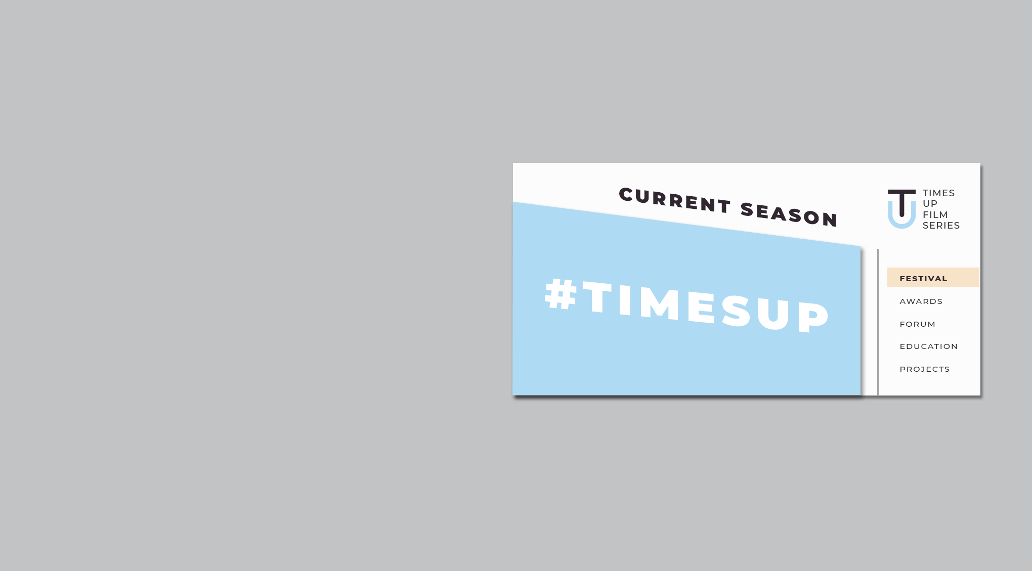
01 #TimesUp
01- A
FILM SERIES +
EVENT GRAPHICS
In partnership with Katra Film Series, brand identity for a new film series, Time's Up Film Series, was developed as well as event graphics for an opening festival.
#TIMESUP
ART DIRECTION / BRANDING

AUDIENCES
Time's Up Film Series serves as a platform for women filmmakers worldwide to share their unique stories and cultural experiences with New York's diverse audience, while promoting diversity and strong female-lead driven content.
FILMMAKERS
The mission is to celebrate women in leadership roles in the entertainment industry and promote and support opportunities for artistic and career growth through different workshops, panels and networking events.
01- B
DETERMINING THE LOOK
TIme's Up Film Series aims to
inspire and celebrate female filmmakers and help create
change in the industry. Inspired
by the #TimesUp movement, the visual identity needed invoke the revolutionary, boundary-breaking goals of the series.


LOGO / WORDMARK
COLORS

FONTS


02 Poetry
POETRY
ART DIRECTION / UX DESIGN
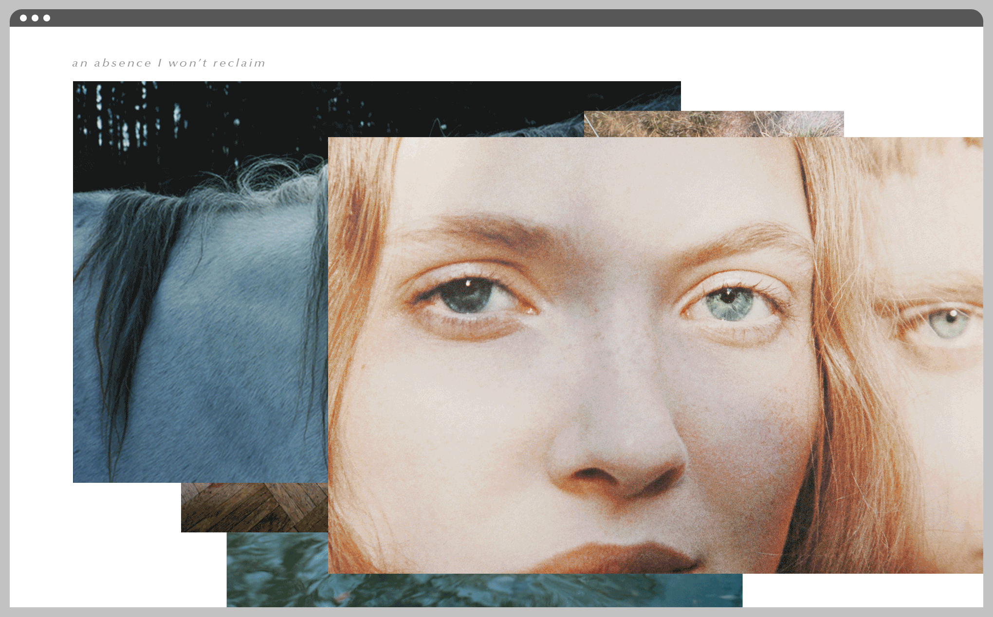
02- A
DIGITAL ANTHOLOGY
A website was created to exhibit a collection of poems and succession of photographs in tandem.

POETRY
Five poems by the poet Rodney Jones are shown on individual pages through the website.
PHOTOGRAPHY
Five photographs provide introduction and further understanding for the poems.


03 Swarovski
SWAROVSKI
ART DIRECTION / 3D DESIGN
03- A
POP-UP RETAIL SPACE + EXHIBIT GRAPHICS
In partnership with VMG Creative and Swarovski, a temporary retail space was created for Chelsea Market in New York City.

RETAIL
SPACE
Showcases various Swarovski crystal products whether jewelry, accessories, homeware, or fashion available for purchase.
CUSTOMER
INTERACTION
Helps visitors make Swarovski crystals their own by highlighting various design applications of Swarovski crystals.
RETROSPECTIVE
DISPLAY
Connects visitors with Swarovski's history and continued influence through partnerships with designers and brands.

MOOD BOARD

NORTH-FACING VIEW - FRONT LEVEL

NORTH-FACING VIEW - BACK LEVEL

WEST-FACING VIEW - RETAIL SPACE

EAST-FACING VIEW - RETAIL SPACE

WEST-FACING VIEW - CONSUMER INTERACTION

SOUTHEAST-FACING VIEW - RETROSPECTIVE DISPLAY

NORTHEAST-FACING VIEW - RETROSPECTIVE DISPLAY

04 ALIX
ALIX
ART DIRECTION / BRANDING / WEB DESIGN
04- A
VISUAL IDENTITY + CREATIVE BRAND STRATEGY
In partnership with Suzanne Randolph of Suzanne Randolph Fine Arts and various city-based travel concierge services, a visual identity and creative strategy was developed for a new venture called Alix.


EXPLORE
Alix provides comprehensive city guides highlighting the best in culture, services, and fine-dining.

CONNECT
Alix is an international membership of women who travel for business and leisure.

REFRESH
Alix hosts curated events and connects members with local concierge services.
04- B
DETERMINING THE LOOK
ALIX is a private women-focused members' club with partners across the globe providing luxury travel services and exclusive one-of-a kind events. The brand identity had to invoke the feeling of luxury, grace, and trust.
BRAND COLORS


BRAND COLORS

BRAND SUITE

04- C
UNDERSTANDING THE BUSINESS
ALIX is a growing start-up which needs to set itself apart in the crowded market of luxury travel and global professional membership services. Successful development of Alix depends on careful planning and communication between departments and partners.
COMPETITIVE ADVANTAGE

ROLL-OUT PLAN

MEMBER EXPERIENCE

04- D
CONNECTING USER + CITY
ALIX members access their services and benefits through the Alix website. The website is easy to navigate and lets users explore cities and reserve services by neighborhood or general request.


05 Courts
COURTS
ART DIRECTION / PRINT DESIGN / WEB DESIGN
05- A
ART BOOK + PORTFOLIO WEBSITE
A series of photographs entitled Courts, by artist Ward Roberts
are exhibited with curatorial commentary in an art book and portfolio website.

ART BOOK
A print book / magazine showcases the photography series with extended curatorial commentary.
WEBSITE
The portfolio website gives viewers a method of access to the entire series of photographs.
05- B
CREATING A PRINT LAYOUT
The reader is led through the photography series through pairs of photographs on each spread. Each individual page and spread is unique building on the distinct composition of each photograph.


05- C
EXPLORING THE COLLECTION
The website gives audiences access to the complete series through a digital archive solely designed for Ward Robert's Courts. The aesthetic of the archive builds on the distinctive style of the series.


06 Givenchy
GIVENCHY
3D DESIGN
06- A
FRAGRANCE DISPLAY
In partnership with Visual Marketing Partners and Givenchy, 3D renderings were created using Solidworks, Rhino, Keyshot, and Photoshop for Givenchy displays featuring Dahlia Divin fragrance.

WINDOW
Visuals from the latest Dahlia Divin photo / video campaign were translated into a 3D window display through choice of material and scale.
TABLE-TOP
Dahlia Divin was showcased in-store through table-top displays featuring two size bottles with framed visuals from the latest campaign.


07 Columbus
COLUMBUS
GRAPHIC DESIGN
07- A
INFORMATION
GRAPHIC
In partnership with the National Weather Service and the Design Department of the Ohio State University, an information graphic was created illustrating weather trends in the Columbus OH area.

TEMPERATURE
Average range of temperatures
per month is illustrated showing average temperature, average high / low temperature,
and highest / lowest recored temperatures. Amount of days per month within a certain range of temperatures is shown as well.
CLOUD COVER
Percentage of days per month with cloud-cover (clear / partly-cloudly /cloudy) is illustrated while also showing the percentage of days with a possibility of sunshine vs rain.
PRECIPITATION
Average precipitation per month
is illustrated in units of inches
as well as average snowfall per month in units of inches.

08 Tory Burch
TORY BURCH
ART DIRECTION / 3D DESIGN
07- A
INFORMATION
GRAPHIC
In partnership with Visual Marketing Partners and Tory Burch, a temporary environment was created to showcase the latest line of swimwear and swim accessories at Miami Swim Week at the Miami Beach Convention Center. The trade-show booth translated the aesthetic of the Tory Burch brand providing a new application appropriate for the venue and the season.

USABILITY
The booth needed to be easy to construct on site and allow
seamless flow of attendee traffic
BRAND
The booth's appearance matched
the defined visual language of
the Tory Burch brand.
08- B
DETERMINING THE LOOK
Mood boards were created to define the aesthetic of the brand that would be translated into the trade-show environment.
THE SPIRIT

DISTINCTIVE STYLE | CULTURED COMFORT | RELAXED ENTHUSIASM
THE WOMAN

EFFORTLESS GLAMOUR | INTELLECTUALLY INDEPENDENT | IMPECCABLY DISHEVELED
THE PLACE

OLD-WORLD CHARM | ARTISANAL QUALITY | PEACEFUL ALLURE
08- C
TRANSFORMING THE VENUE
Tory Burch annually takes part in Miami's SwimShow to showcase their latest line of swimwear. It is the largest international tradeshow for swimwear and swim accessories.
THE VENUE


08- C
CREATING AN ENVIRONMENT
The final direction of the design incorporated materials reminiscent of Tory Burch's stores with a focus on their beach collection. The walls
of the booth were built in panels.
One side of the booth was brought inward two feet to make room for
a hidden lockbox.
MATERIALS

FLOORPLAN

FINAL DIRECTION

bottom of page